Getting started with Variance
In Variance, data graphics are created using special new data visualization tags that work like regular HTML — tags like <chart>, <line>, <point>, and <repeat>.
These independent components can be composed together to build custom data graphics, with a set of rules much like a language’s grammar.
Unlike libraries that provide a fixed set of chart types (line, bar, et al.), Variance’s “grammar of graphics” enables you to quickly and easily build graphics specifically tailored to your needs. It’s very simple to try out different visual representations — moving from points to bars to lines — without having to reshape your dataset or learn a new function API.
To get started, let’s build a simple dot plot. We’ll start with a plain old HTML page that includes the Variance JavaScript:
<html>
  <body>
    <script src="http://variancecharts.com/cdn/variance-noncommercial-standalone-6d26aa2.min.js"
            charset="UTF-8"></script>
  </body>
</html>
Next, we’ll add a small CSV dataset directly to the page.
This tag can go anywhere inside the <head> or <body> tags of the document.
Note the ID, quarterly-sales, which we’ll use later to refer to this dataset from charts elsewhere on the page.
A simple way to depict this data is to draw a point for each sales quarter, mapping the amount of sales to the horizontal position of the point.
We’ll add a <chart> tag to the <body> of our page, just like we’d add an <img>, <p>, or any other plain HTML tag:
<csv id="quarterly-sales">
  quarter,sales
  Q1,493
  Q2,573
  Q3,639
  Q4,855
</csv>
<chart data="#quarterly-sales" scale-x-linear="300 1000">
  <repeat>
    <dot map-position="sales"></dot>
  </repeat>
</chart>
This yields the graphic at right.
The repeat element duplicates its children once for every object in the data array on its scope; thus, we end up with one dot for each datum.
As you’ve probably guessed, the scale-x-linear attribute of <chart> adds a linear scale to the chart’s scope with a domain of [300, 1000].
The map-position attribute of the <dot> tells the dot geometry that its position mapping should be calculated according to the sales property on its scope.
Each dot uses this value with the chart’s x-scale to position itself.
Of course, context-free dots aren’t very helpful, so lets add a title, labels for each quarter, and an x-axis guide:
<h4 style="text-align: center;">Quarterly Sales ($USD)</h4>
<chart data="#quarterly-sales" scale-x-linear="300 1000">
  <guide-x></guide-x>
  <repeat>
    <annotation class="left">{{quarter}}</annotation>
    <dot map-position="sales"></dot>
  </repeat>
</chart>
And here’s our final scatterplot chart, produced with only a few brief, declarative lines of HTML markup.
As you can see, Variance provides a basic visual style by default, but all elements of a graphic can be fully styled via plain CSS or Sass for a completely custom visual aesthetic.
Quarterly Sales ($USD)
Visualization exploration
Declarative HTML is nice, but the real benefit of the compact grammar is that it allows you to quickly navigate the space of possible visualizations. There’s no need to stop and reshape the data from, say, an array of objects to an array of arrays or vice versa. We can change our dot plot to a bar chart by changing dots to bars:
<h4 style="text-align: center;">
  Quarterly Sales ($USD)
</h4>
<chart data="#quarterly-sales"
       scale-x-linear="300 1000">
  <guide-x></guide-x>
  <repeat>
    <annotation class="left">
      {{quarter}}
    </annotation>
    <bar map-length="sales"></bar>
  </repeat>
</chart>
Note, however, that we also had to change our data mapping from the dot’s position to the bar’s length.
This may seem like a trivial distinction, but in practice it’s crucial because people perceive those two visual aesthetics very differently.
Psychologically, humans will interpret the length of a bar as an amount, whereas we do not make such a leap for the position of a dot.
Naomi B. Robbins has a great paper on dot plots vs bar charts.
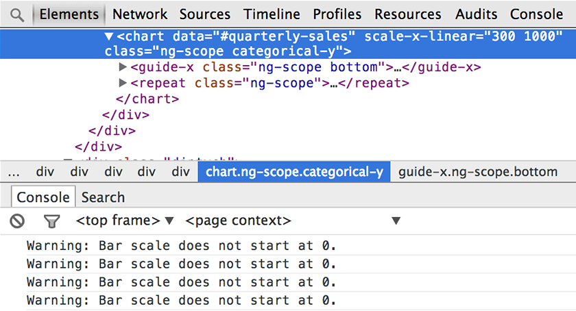
Variance will give you a friendly warning in the web console when you tell a visual lie (accidently, of course).

People tend to expect and prefer vertical bar charts. Since each bar has a short label, flipping the orientation won’t hurt. Changing the scale and guide from x to y does the trick. Let’s also fix the scale domain and move the annotations to the bottom:
<h4 style="text-align: center;">
  Quarterly Sales ($USD)
</h4>
<chart data="#quarterly-sales"
       scale-y-linear="0 1000">
  <guide-y></guide-y>
  <repeat>
    <annotation class="bottom">
      {{quarter}}
    </annotation>
    <bar map-length="sales"></bar>
  </repeat>
</chart>
Quarterly Sales ($USD)
That’s it for the intro tutorial. You’ve hopefully gained an understanding of what sets Variance apart from other charting libraries. Check out the example gallery for more complex, stylized graphics; the full documentation to see all the different kinds of geometry and when to use them most effectively; or get Variance to start using it on your own projects.